“This UI is bonkers. I tried to post an image…it was not successful.”
“I know this is beta, but it seems really clunky.”
“I can’t find anything on this thing!”
If you’ve been on Ello, you’ve probably noticed that, well, it’s not exactly easy to find things. We’re not talking about obscure user settings, either–we’re talking about functions that are vital to the site, like uploading images, posting, and editing. And, hey, let’s be real: if someone visits your web site and can’t find what they’re looking for, your web site is not doing its job.
How can you fix that? There are a few simple things that you can do to make your user’s experience easier to bear, so your web site can build that effective connection with each person who visits you.
 Contrast, Contrast, Contrast.
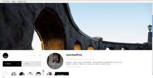
Part of the problem with the Ello interface is Contrast: the colors of different elements don’t pop enough against the background. Important function buttons are light-grey on a white background, which makes them hard to find, because your eyes are getting pulled towards the darker icons and text. How long will it take for your average user to get frustrated, when they can’t easily find the button they need?
For important things on your web site, like vital information, frequently-used links, or Calls to Action, you’ll want to have good contrast to make sure they don’t get lost. We’re not saying you should bust out the day-glo green, or anything, but wise use of light-on-dark or dark-on-light can get you a long way.
Icons: What’s That Shape Mean, Anyway?
The icon trend has been on the rise in web site interfaces since well before Ello hit the Intertubes, but they weren’t shy about jumping on that wagon. The problem is, while certain icons are fairly universal–or at least easy enough to figure out–others are, well, a tad confusing. Would you have guessed that the (+) icon would mean, “Invite,” before you hovered over it?
This principle goes back decades in web site building: don’t make your web site user think. “Mystery meat” links and icons can be confusing, and nobody likes to go in guessing. It should be easy for your visitors to figure out what different links and buttons lead to. If it isn’t? You risk losing their attention, and their business.
There’s More Than One Way
One of my bigger beefs with the Ello interface is photo uploading: for using images in posts, there’s an upload button, but to change your Profile photo or Header photo, you’re forced to drag-and-drop the image you want. In fact, they have to specifically instruct you (on hover, of course) to drag-and-drop. If you don’t hover over that profile photo, you’ll never know what to do.
Not only is it dreadfully inconsistent, but it’s also not terribly intuitive. And, seriously, who forces Drag-and-Drop as the only option for a photo upload?
Not everyone is going to engage with your web site in the same way. Different people use different devices, and they’ll flow through your content in different ways. We don’t expect you to go out of your way to serve absolutely every stone-age 1990s refugee desktop PC in the world, but an extra option or a bit of adaptability can go a long way towards helping your viewer find what they need, so they can take advantage of what you’re offering them.
Small Changes, Big Impact.
The temptation to get super-slick with your web site can be hard to resist, but the best answer to making your web site more effective is often the simplest one. Small changes can make a huge difference in how people interact with your web site, how they respond to what you have to offer, and whether or not they contact you or get interested in your product.
Your web site’s mission is to make the most important parts of your brand and your business easy to find and to learn about. Don’t get so caught up in style that you lose out on connection.
Portland branding agency – Portland web design – Upswept Creative


