
Branding is all about creating a memorable impression of your work that appeals to your ideal client. Sometimes, that means overcoming common assumptions about your product… and when it comes to public perception, legal marijuana dispensaries have an especially tough challenge.
Marijuana was legalized in Portland less than a year ago, and as a previously illegal product, it had a lot of less-than-positive sentiment attached to it. Dispensaries have a lot to gain from the newly-opened market, however, and they’ve taken a few different strategies to help ease our transition from marijuana as a taboo item to a desirable product.
Make cannabis fashionable and high-end.

One of the splashiest advertisements to pop up was the huge billboard for New Vansterdam, which I first encountered traveling eastbound on the Burnside Bridge. This particular marijuana retailer not only had to combat the stereotypes attached to our idea of the “average” marijuana enthusiast, but it also had to entice a Downtown Portland audience to travel up to the (arguably, not-so-hip) land of Vancouver to replenish their supply.
Making weed into something coveted and “cool” was their game. Their use of sweeping, dramatically-lit landscape imagery and clean, stylized logo design communicated a more exclusive feel at a glance. They also chose their language carefully–referring to themselves as a, “cannabis market,” calls out to the high-end audience that would choose to shop at boutiques with hand-selected wares over a big-box department store.
Emphasize the health aspect.
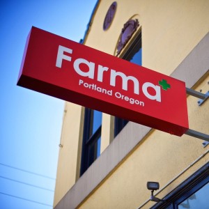
The medicinal uses for cannabis have been a hot topic for years, and some dispensaries have chosen to double down on the health angle–the green cross symbol calls back to the medical connotations of the original red version of the symbol, and it has quickly become an easy, visual shorthand for marijuana dispensaries.
Retailers such as SE Portland’s Farma have taken that medicinal angle a step further, and built their brand using a clean design aesthetic, with an equally clean look to their facility. Even without going inside, a peek through the front window reveals an entryway area boasting clean, white walls, with modern graphic decoration in their iconic green. This all ties in seamlessly with their slogan of, “Dispensing Modern Medicine.”
Make marijuana approachable.
The transition from weed being illegal and frowned-upon, to being both legal and acceptable isn’t going to happen overnight. Oregonians are still getting used to the idea that they can talk about their marijuana use in public, and it isn’t an activity that’s only for ne’er-do-wells.
We can’t help but think that the owners of Hi Casual Cannabis had that in their minds when they created their advertising. Although their brand assets may not be as well-developed as some of the other dispensaries in the area, their sign design is intentionally approachable, using playful type and energetic color.
Their simple decision to use the phrase, “casual cannabis,” is also a smart move: it reaffirms the idea that marijuana is both something that is 100% okay to use, and that people can smoke weed without harming their overall lifestyle. “Casual Cannabis,” sounds more like an ice cream sundae or a double-bacon cheeseburger: it’s a Sometimes Treat that we can enjoy as part of an otherwise healthy lifestyle. 😉
