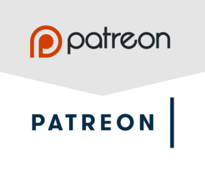
Logo design has come under a ton of scrutiny, thanks to increasing numbers of people using social media. Now, basically any well-known company who dares to update their brand assets open themselves to critique from the internet at large. (even I had some choice words about a big-name logo redesign, several years ago!)
Patreon’s recent update to their logo was no exception, and it got me thinking about how design trends have evolved, and how some principles of logo design continue to ring true.
What Are The Different Parts of a Logo?
Some of you may already know these terms, but for those of you reading this who aren’t design professionals, here’s a quick look at different logos and parts:
- Logotype: also known as a “wordmark,” this is the choice of font, spacing, and styling used for the words in your logo.
- Icon or Mark: this is the visual icon designed to represent your brand. It can appear with the logotype, but ideally can also stand alone as a visual shorthand for your business.
- Combination Mark: this refers to usages of a logo where the Icon and Logotype appear together.

Good Type Design Can Make or Break Your Logo
Something the new Patreon logo does well is bring clarity and focus to its logotype. Where the old logotype feels cramped and off-kilter, the new one feels more open and modern.
Whether it’s creating a new logo or reimagining an existing one, I often see combination marks where an incredible amount of mental energy was spent on the icon, but the logotype feels like an afterthought.
One example that comes to mind is the Multnomah County Library logo. Their announcement of their new logo went on at great length about the thinking behind their L mark, but the type received no mention. That alone tells me a lot about where the majority of their design process was focused.
My biggest criticism of the Library logo is that the text doesn’t look like it’s designed with intention. The type looks generic and doesn’t seem designed to go with its icon, so it feels weak as a combination mark. Their update of the icon is a solid idea, but how much better could it be if the logotype was as well-designed as the icon?
Color Can Separate Your Logo From The Pack
Another good choice that Patreon made with their logo update was the updated color palette. Patreon chose salmon and navy as their key colors, which is a modern and distinctive update from their orange-and-black logo. And, they’re also colors that haven’t been so widely used among popular brands.
As we saw in PayPal’s recent lawsuit against Pandora for their perhaps-too-similar blue “P” logos, similar ideas are bound to float up in design. And, in a world where logos may be hard to tell apart, your brand colors can save you from fading away with the competition. In fact, some high-profile brands have built enough strength in their color palette that their colors have become iconic even alone. (take a look at “Which Brands Own These Signature Colors?” for a few fun examples)
Remember What You Want To Communicate

A trend in logo design that’s gained traction is to make the logo iconic enough that it can be adapted or stylized with different colors or textures, depending on where they’re being used. Michael Bierut cited this approach in an episode of 99% Invisible, when talking about his work on Hillary Clinton’s presidential campaign logo. Contemporary logo design trends seem to be leading us towards very abstract marks, which can easily end up confusing or weak.
Communicating in subtle ways with shape is smart, and it leads to clever and long-lasting logo ideas, such as the FedEx logo and its hidden arrow. It’s also an approach that I use in my own work. In the mark I created for Marissa Sainz, the top-left point of the “M” is used as a teal arrow pointing towards the NorthWest. That calls back to Portland and the Northwest, and also to her roots as a realtor in the Pearl District in NW Portland.
It’s easy to go too abstract, however, or to make design decisions that are so subtle they get lost. One comment about Patreon’s new icon says that the vertical bar is, “a subtle but proper nod to Patreon being the bridge between two things.” But really, would you see that nod if you weren’t told about it? Will their target audience see it?
I appreciate subtle communication as much as any designer, but I’ve also seen long-winded explanations of too-subtle logo design concepts. If you have to devote paragraphs of explanation to make a design idea understood, then it’s probably not communicating well. A good icon should be able to stand alone, and abstract shapes may not carry enough weight to do that.
It’s All About The Balance
One of the toughest aspects of logo design is communicating volumes about a brand in a limited space. There’s very little room for fine details or artwork, and it needs to make an impression quickly. Above all else, a logo needs to be memorable, and it needs to communicate clearly.
Finding that perfect balance between deep communication and abstract visuals is a tricky thing, but once you find that sweet spot, you’ll feel a boost of confidence in your brand, and you’ll stick in the memories of people who need your talents.
If your business needs a refresh and you’re not sure where to begin, maybe it’s time for an assist from branding experts like us! Reach out to us about your design needs–we’d love to chat with you soon.


